Chat window settings: name, greeting, and input
Go to Apps → Vosaire: AI Chatbot & Sales → Widget. The Design tab (the default view), and within it the Chat tab (also the default), controls the text and behavior of the chat window itself. Every change appears instantly in the Live preview on the right — nothing needs saving first.
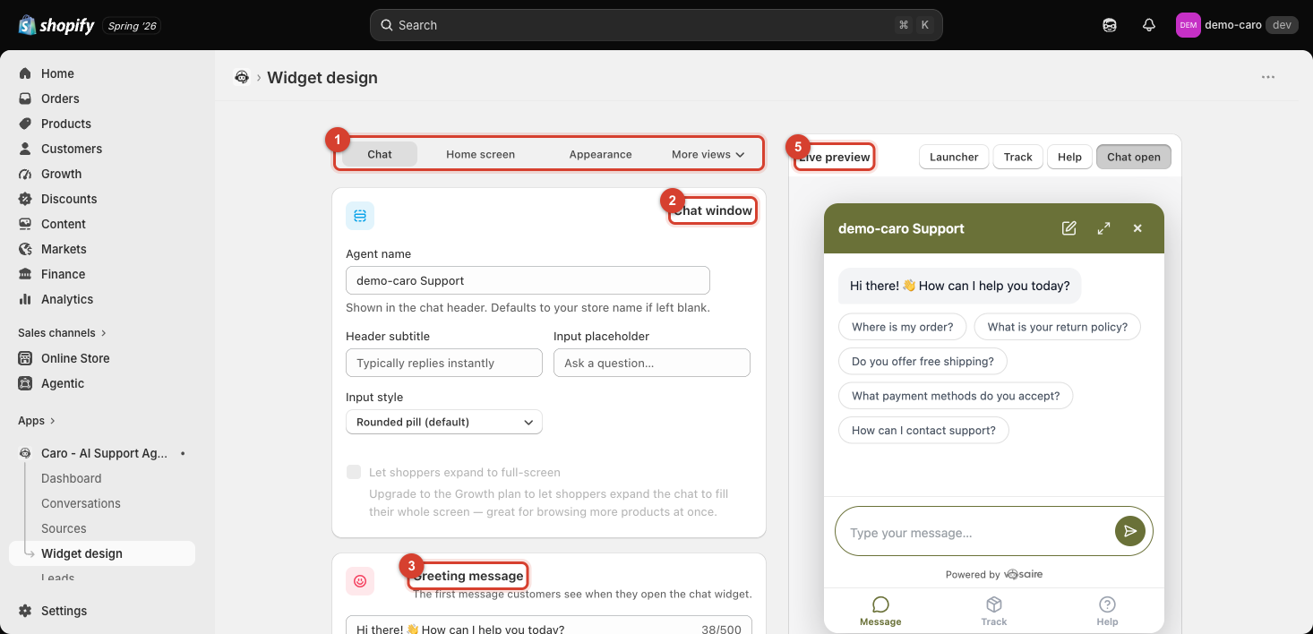
Chat window
| Field | What it does |
|---|---|
| Agent name | Shown in the chat header. Defaults to your store name if left blank. |
| Header subtitle | Small text under the agent name (e.g. "Typically replies instantly"). |
| Input placeholder | Placeholder text in the message box (e.g. "Ask a question…"). |
| Input style | Shape of the message input — Rounded pill is the default. |
Let shoppers expand to full-screen lets customers blow up the chat window to fill their whole screen — useful for browsing more products while chatting. This requires the Growth plan or higher; on Starter it's shown disabled with an upgrade prompt.
Full-screen chat on mobile is on by default: on a phone screen, the chat takes over the whole viewport like a native chat app (WhatsApp/Telegram) instead of floating as a small card over your store. Turn this off to keep the small floating-card look on mobile too — useful if a full-screen takeover feels too aggressive for your storefront's design. This is unrelated to the Growth-plan expand button above: it controls the default mobile layout, not an optional customer-triggered action.
Greeting message
The first message customers see the moment they open the widget, before they've typed anything (up to 500 characters). Keep it short and specific — e.g. "Hi there! 👋 How can I help you today?" — since it sets the tone for the whole conversation.
Suggested questions
Clickable shortcut buttons shown right under the greeting, letting customers start a conversation with one tap instead of typing. You can add up to 6.
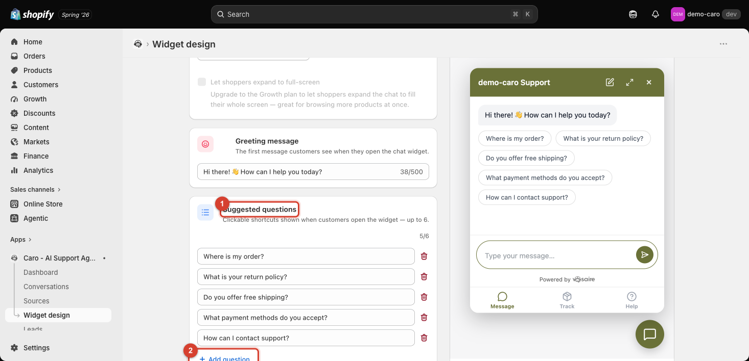
- Click Add question to add a new shortcut (up to the limit of 6, shown as a counter like "5/6").
- Click the trash icon next to any question to remove it.
- Pick the questions customers actually ask most — "Where is my order?", "What is your return policy?" — since these are the fastest path into a conversation and directly shape what customers expect Vosaire to help with.
Product cards in chat
Controls how a product looks whenever Vosaire shows one inside a conversation — for example when it recommends an item or answers a product question. This is separate from the Home screen's product row (see Setting up the Home screen): that row has its own fixed layout and never reads these settings, even though two of the checkboxes below apply to both places.
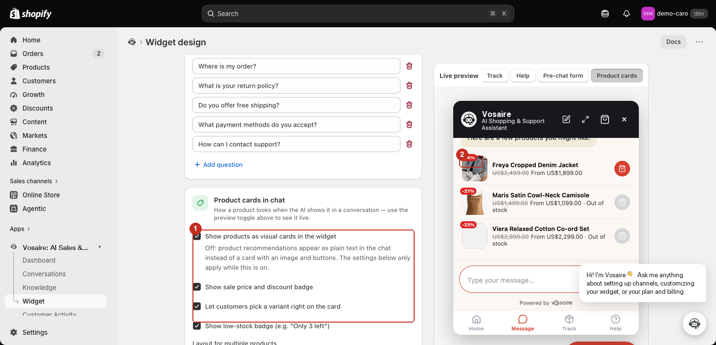
- Product cards in chat — use the preview toggle above the Live preview panel (switch it to Product cards) to see these live.
- Show sale price and discount badge / Let customers pick a variant right on the card — both apply everywhere a product card renders, in chat or on the Home screen row.
- Show low-stock badge (e.g. "Only 3 left") and Layout for multiple products — Carousel (horizontal scroll), Row, or Stacked. The layout choice only affects chat product cards; the Home screen's row always uses its own layout regardless of what's picked here.
- Example: the discount badge rendering on a real product card in the live preview.
Live preview
The panel on the right always reflects your current settings live. Use the Launcher / Track / Help / Chat open / Product cards buttons above it to preview each state of the widget without needing to open your actual storefront.