Using the Live preview to test before publishing
Every tab on the Widget design page (Chat, Home screen, Appearance, Behavior, Help Center, Order tracking) shares the same Live preview panel on the right-hand side.
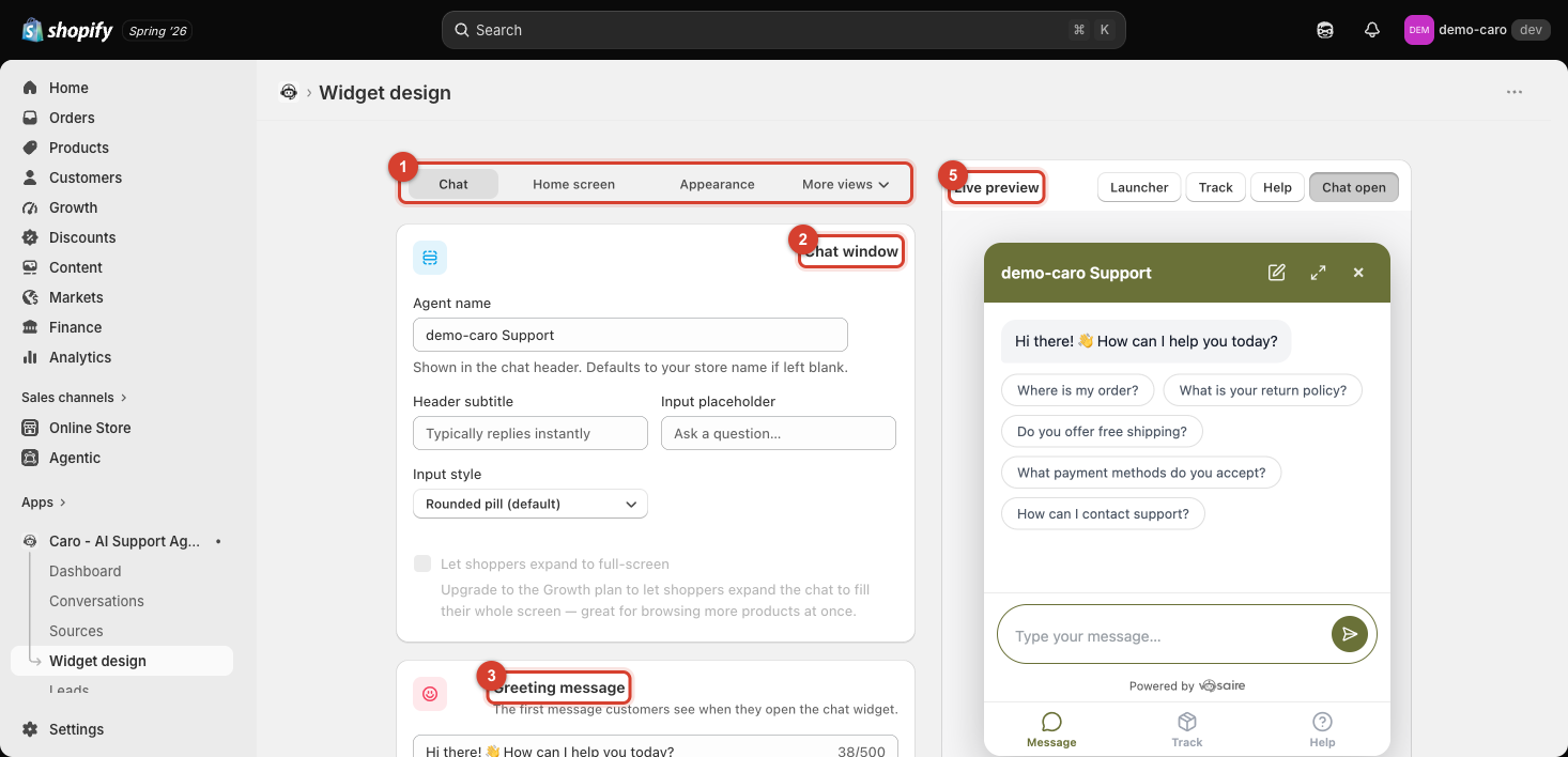
It's live, not a mockup
Text under the preview always says "Live — updates as you type, nothing needs saving first." Every field you edit — a color, a greeting, a checkbox — reflects in the preview immediately, before you click Save. This means you can experiment freely and only commit once it looks right.
Checking every state, not just Chat
The buttons above the preview (Launcher, Home, Message/Chat open, Track, Help) switch the preview between the different views a customer might actually land on:
- Launcher — the collapsed bubble/pill before anyone clicks it (see Appearance: colors, launcher, and avatar).
- Home — the welcome screen, if enabled (see Setting up the Home screen).
- Message / Chat open — the main conversation view.
- Track — the order lookup form, if enabled (see Setting up the Order tracking tab).
- Help — the Help Center tab, if enabled (see Setting up the Help Center tab).
It's easy to only check the Chat state and miss that, say, your brand color clashes with the Home screen's promotion banner — get in the habit of clicking through every enabled state after a design change.
Testing on your real storefront
The Live preview approximates the real widget, but the final check is always your actual storefront — use the Test it step on the Dashboard checklist, or View my store, to confirm everything renders and responds as expected in a real browser tab.