Setting up the Home screen
By default, the widget opens straight into chat. Go to Apps → Vosaire: AI Chatbot & Sales → Widget → Design → Home screen to turn on a welcome screen instead — useful if you want customers to see quick options (track an order, browse products) before typing a question.
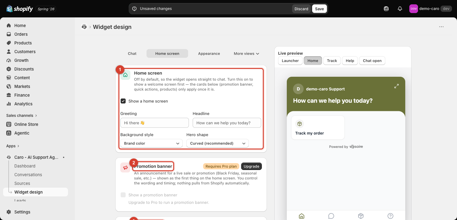
Turning it on
Check Show a home screen. The cards below it (Promotion banner, Quick actions, Show products) only take effect once this is on.
Basics
- Greeting — a short line (e.g. "Hi there 👋").
- Headline — the main message (e.g. "How can we help you today?").
- Background style — currently Brand color (uses your widget's brand color, set on the Appearance tab).
- Hero shape — Curved (recommended) is the default header shape.
Promotion banner — Pro plan
An announcement banner for a live sale or promotion, shown as the first thing on the home screen. You write the wording and control the timing yourself — it doesn't pull anything from Shopify automatically. This card requires the Pro plan; on lower plans it's shown locked with an Upgrade button.
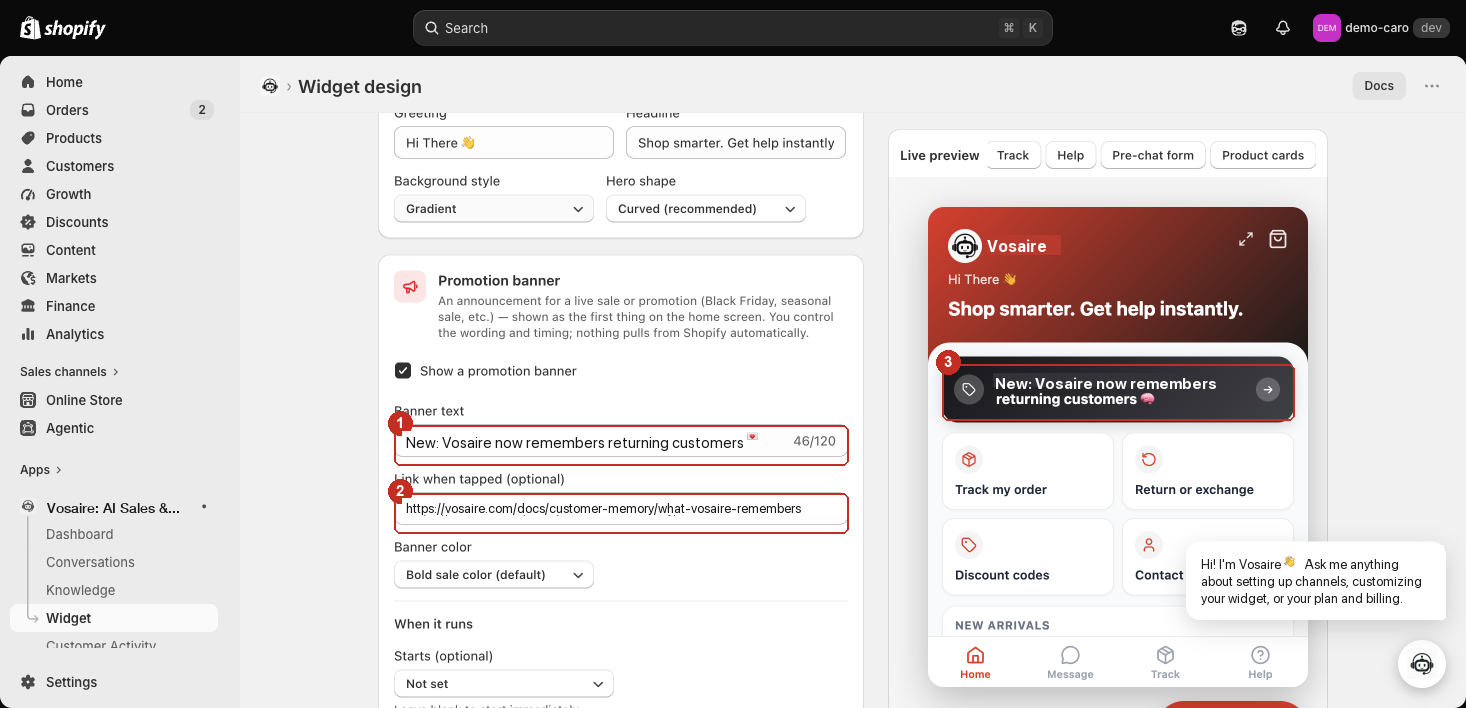
- Show a promotion banner — turns the whole card on. Nothing below matters until this is checked.
- Banner text (120 characters) — the line customers see, e.g. "🎉 Summer Sale — 30% off everything". Updates live in the preview as you type.
- The banner renders as the first thing on the home screen, above quick actions and the product row.
Link when tapped (optional) — where tapping the banner sends the customer (e.g. your sale collection URL). Leave blank for a banner that's purely informational.
Banner color has three options: Bold sale color (default) (uses the site's built-in sale-red), Custom color (pick one solid color), or Gradient (pick two colors to blend between).
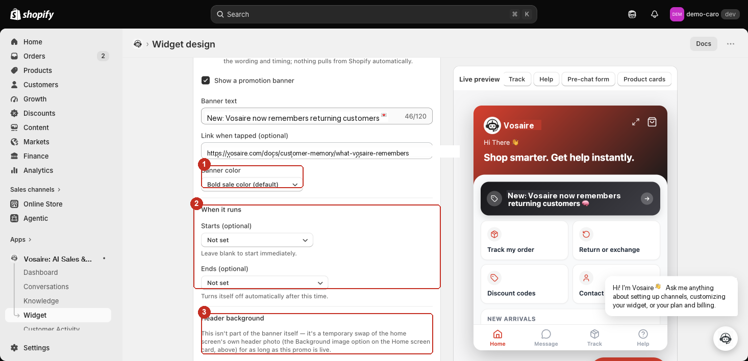
- Banner color — as above.
- When it runs — Starts and Ends are both optional. Leave Starts blank to go live immediately; leave Ends blank to run indefinitely. Set Ends and the banner turns itself off automatically at that time — no need to remember to come back and disable it.
- Header background — this is not part of the banner itself. It's a temporary swap of the home screen's own header photo (the Background image option on the Home screen card, above) for as long as the promo is live, letting you run a themed header (e.g. a Black Friday graphic) that reverts automatically once the promo ends.
Quick actions and Show products
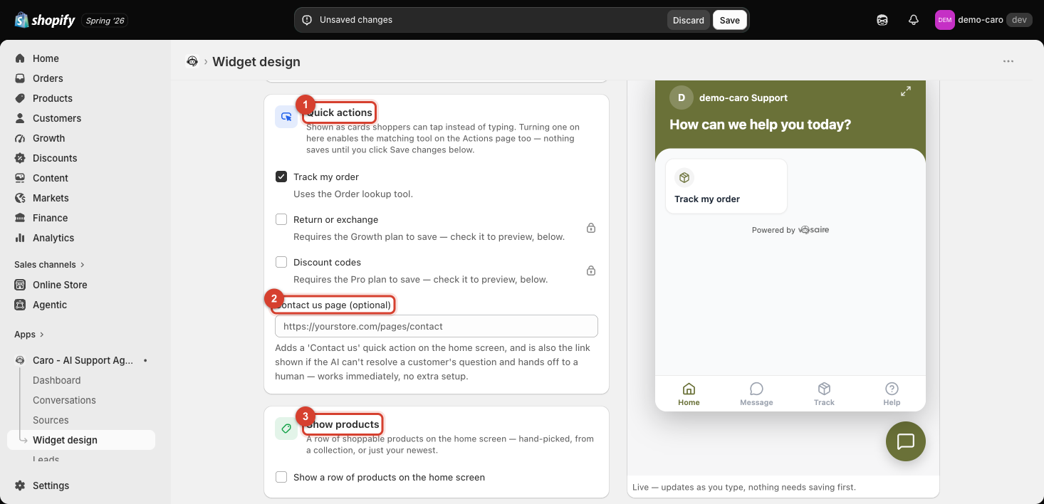
Quick actions are tappable cards on the home screen:
| Action | Plan required |
|---|---|
| Track my order | Available on all plans — uses the Order lookup tool |
| Return or exchange | Requires the Growth plan to save (you can check it to preview first) |
| Discount codes | Requires the Pro plan to save (you can check it to preview first) |
Turning on a quick action here also enables the matching tool on the Actions page — see Sales & Support Actions. Nothing saves until you click Save in the top bar.
Contact us page (optional) — paste your store's contact page URL to add a "Contact us" quick action, and to give Vosaire a link to hand off to when it can't resolve a question. This works immediately with no extra setup.
Show products adds a row of shoppable products to the home screen — hand-picked, from a collection, or your newest items. Requires the Growth plan (or higher); on Starter it's shown locked.
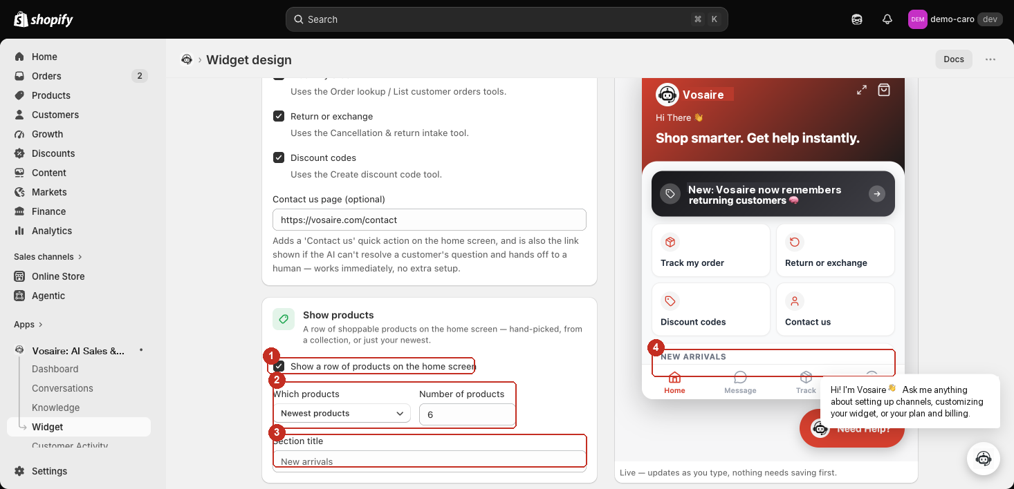
- Show a row of products on the home screen — turns the row on.
- Which products / Number of products — choose the source: Newest products (your most recently added, up to 12), A specific collection (opens Shopify's own collection picker, then shows the newest N products from it), or Choose specific products (hand-pick exactly which products appear, via Shopify's product picker — up to 12). Number of products doesn't apply once you're hand-picking; it's capped at 1–12 either way.
- Section title — the heading shown above the row (e.g. "New arrivals"). Leave blank to use the default.
- The row renders on the home screen exactly as configured — shown here as "New arrivals" with the newest-products source.
Previewing your changes
The Live preview panel updates instantly as you type — switch it to the Home view (next to Launcher/Track/Help/Chat open) to see exactly what customers will see before you save.