Appearance: colors, launcher, and avatar
Go to Apps → Vosaire: AI Chatbot & Sales → Widget → Design → Appearance to control exactly how the widget looks. Every section has its own Reset to default, plus a global Reset all to default at the top.
Colors
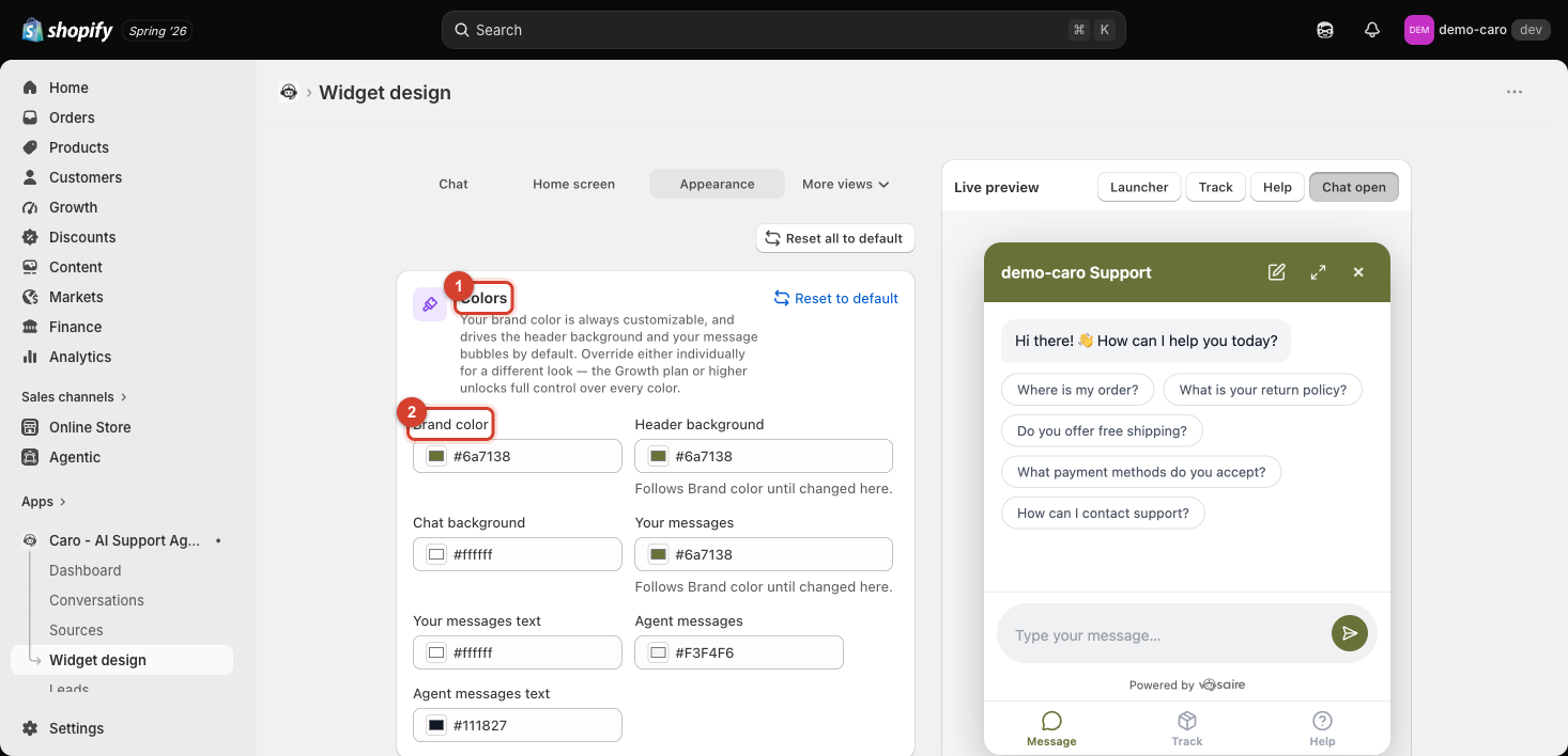
Your Brand color is always customizable and drives two things by default: the header background and your (the customer's) message bubbles. You can override any of the 7 colors individually for a different look:
| Field | Default behavior |
|---|---|
| Brand color | Your base color |
| Header background | Follows Brand color until changed |
| Chat background | White |
| Your messages | Follows Brand color until changed |
| Your messages text | White |
| Agent messages | Light gray |
| Agent messages text | Dark gray |
Full control over every individual color requires the Growth plan or higher — on lower plans, changing Brand color updates the linked fields together.
Launcher
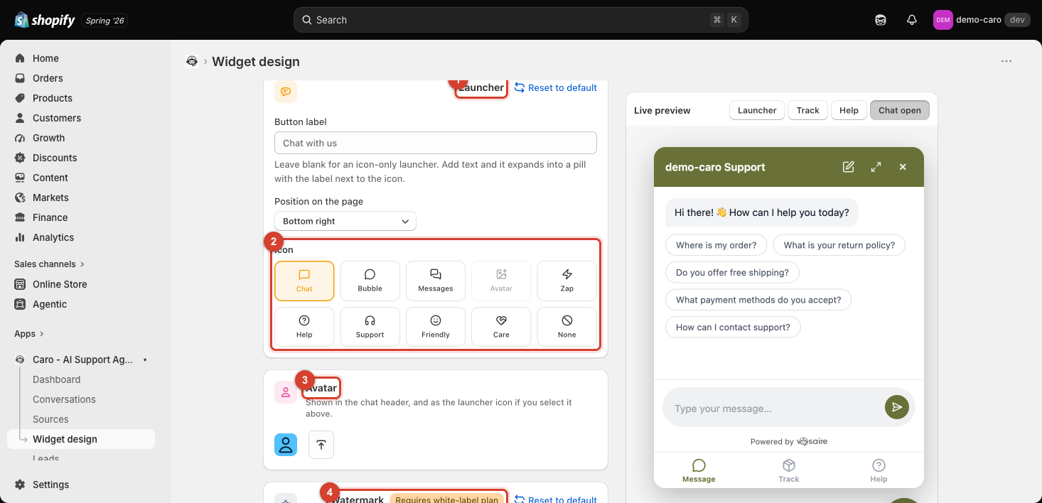
- Button label — leave blank for an icon-only round launcher, or add text (e.g. "Chat with us") to expand it into a pill with the label next to the icon.
- Position on the page — currently Bottom right.
- Icon — pick from 10 presets: Chat, Bubble, Messages, Avatar (uses your uploaded avatar instead of an icon), Zap, Help, Support, Friendly, Care, or None.
Avatar
Shown in the chat header, and as the launcher icon if you select Avatar above. Click Upload image to replace the default initial-letter avatar with your own logo or photo. See Uploading a custom avatar for the chat header and launcher for the full upload and launcher-selection walkthrough.
Watermark
The "Powered by Vosaire" line at the bottom of the chat window is on for every plan below white-label. If you're on a plan that supports it, use the checkbox here to turn it off; otherwise you'll see an Upgrade prompt. See Plans and what they unlock.