
Everything about how the widget looks and behaves is controlled from the Design tab of your agent. Changes apply instantly — you don't need to update the embed code on your website.
Go to your agent → Design tab.
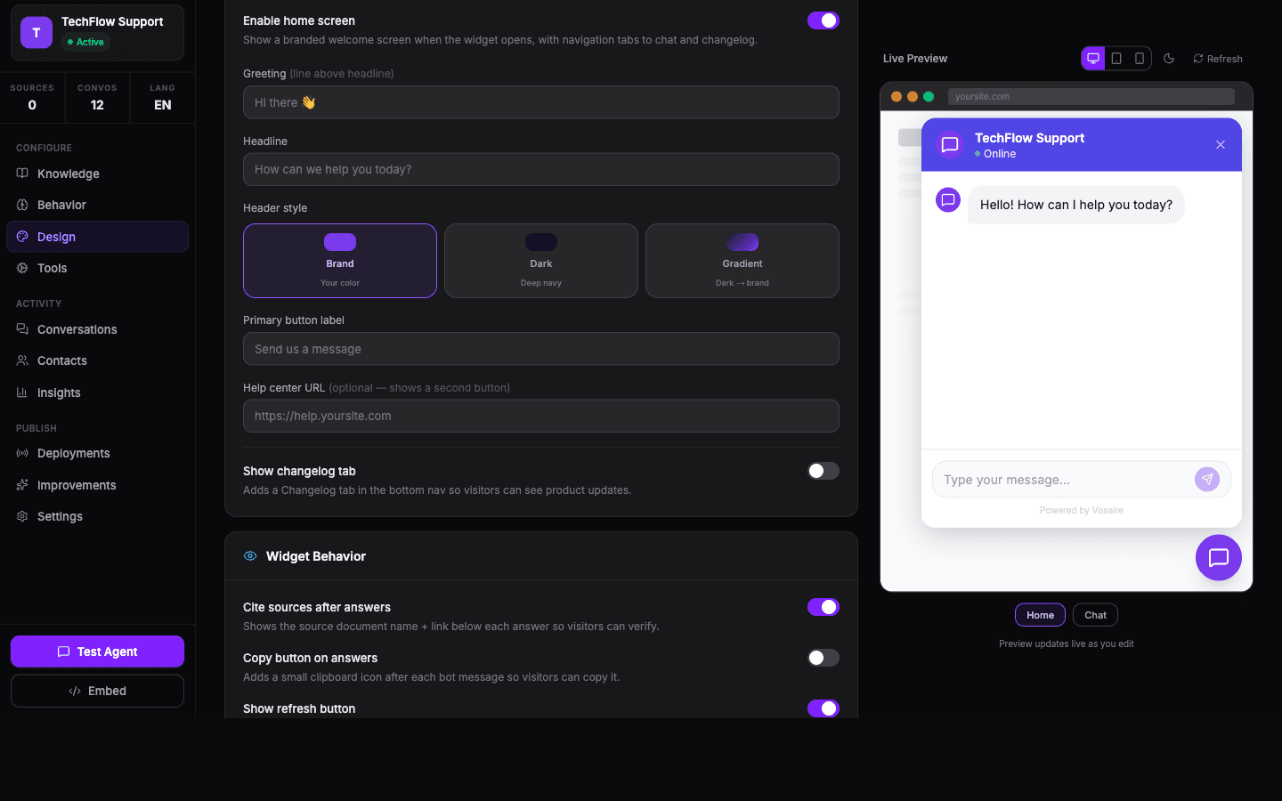
Quick changes — themes
The fastest way to change the look is to pick one of the preset themes. Click any theme card and the preview on the right updates immediately. Themes affect colors, border radius, header style, and the overall feel.
Colors
Below themes, you can customize individual colors. Click any color swatch to open a color picker, or type a hex value directly.
Brand color — the main theme color. Used for the launcher bubble, header, and link colors.
User message color — the background of the visitor's chat bubbles.
AI Agent message color — the background of your agent's replies.
If you want a minimal widget that matches your site's color scheme exactly, start with the Minimal Ghost theme and override just the brand color with your primary brand color.
Launcher customization
The launcher is the button that sits on your page before the user opens the chat.
Launcher label — the text next to the bubble ("Chat with us", "Get help", etc.)
Launcher icon — choose from built-in icons or upload a custom avatar image
Position — Bottom Right, Bottom Left, Top Right, or Top Left
Animation — Pulse, Bounce, Ring, or None. Pulse is the most common choice for drawing attention without being too distracting.
Teaser message
A speech bubble that floats above the launcher after a delay. Good for drawing attention to the widget:
"Any questions? I'm happy to help 👋"
Set it to appear after 5–10 seconds so it doesn't immediately interrupt someone who just landed on the page.
Auto-open
The widget can open automatically after a delay. Useful on high-intent pages like pricing or checkout. Set the delay in seconds. Keep it to 10 seconds or more — instant auto-open tends to feel aggressive.
Quick chips
Up to 4 clickable buttons above the launcher. When clicked they pre-fill a message. Keep them short and action-oriented:
- "Pricing →"
- "Get started"
- "See a demo"
Widget size
Default: 600px height × 400px width. If your site has a fixed header/footer, you may need to reduce the height so the widget doesn't overlap navigation elements.
Custom CSS
For anything not covered by the design controls, use the Custom CSS field. Changes here apply directly to the widget. Example to hide the watermark:
.vosaire-watermark { display: none; }
Custom CSS is best used sparingly — theme updates may override your changes.
Changes go live instantly
One important thing: any design changes you make in the Design tab immediately affect the widget on your website. You don't need to update the embed code. The embed code just points to your agent — the agent's design settings are fetched at runtime.