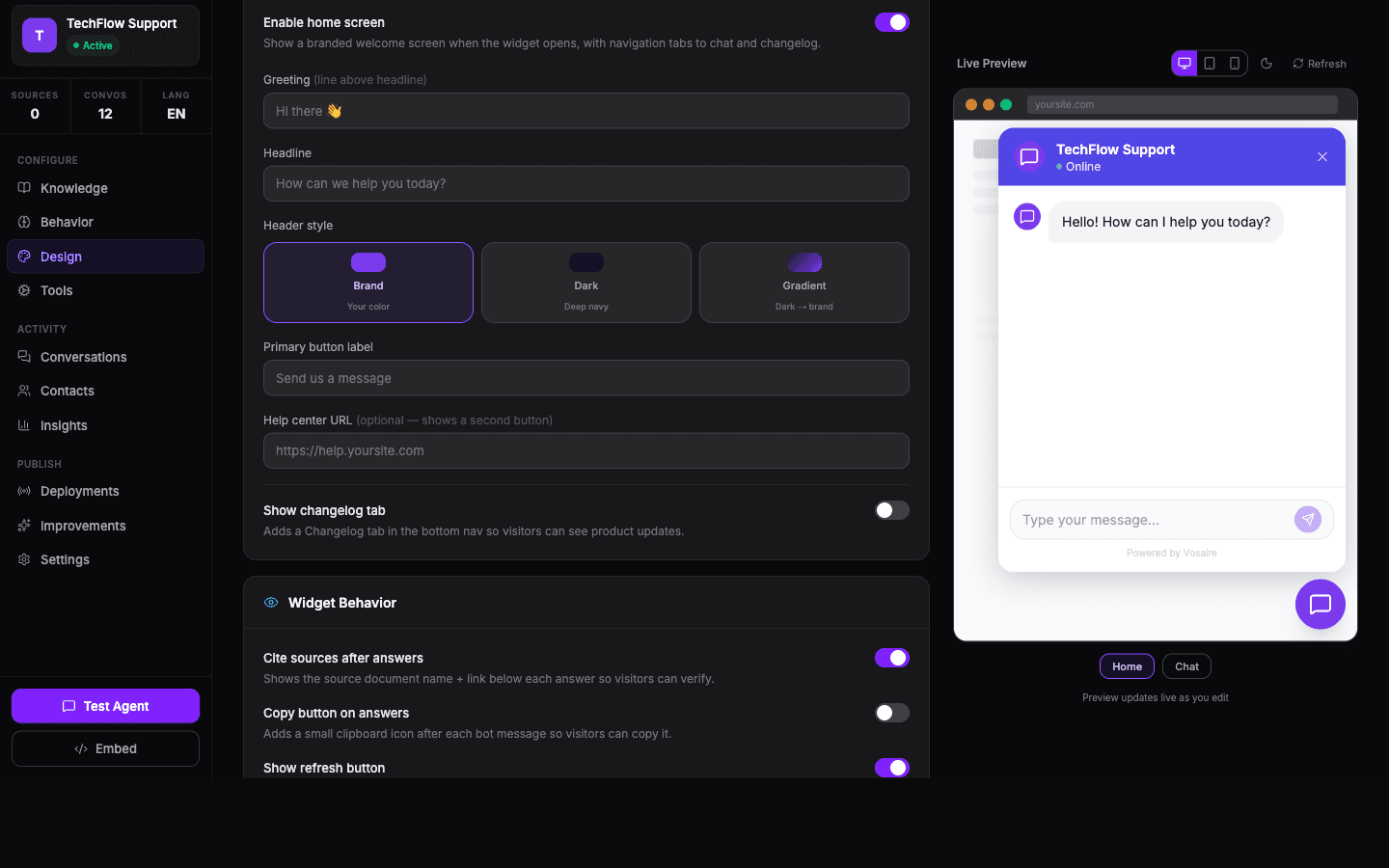
The Design tab controls everything visual about the chat widget on your website. There's a live preview on the right side that updates as you make changes — you don't need to save and reload to see what things look like.
Go to your agent → Design tab.
Themes
The quickest way to change the look is to pick one of the pre-built themes:
- Classic — clean and professional
- Gradient Pro — vibrant gradient header
- Minimal Ghost — light, unobtrusive
- Dark Mode — dark background throughout
- Friendly — rounded, warm, approachable
- Glass — frosted glass aesthetic
Some themes require a Growth or Business plan. If a theme is locked, you'll see an upgrade prompt.
Colors
Below the themes you can fine-tune individual colors:
- Brand/accent color — the main color used for the header and buttons
- Header background — defaults to the brand color, but can be set independently
- Chat area background — the main conversation area
- User message bubbles — background and text color
- AI Agent message bubbles — background and text color
Click any color swatch to open a color picker. You can also type a hex value directly.
Home screen
The home screen is what users see when they first open the widget, before they start chatting. You can:
- Enable/disable it entirely
- Set a greeting ("Hi there 👋")
- Set a headline ("How can we help you today?")
- Choose a header style (Brand, Dark, or Gradient)
- Set the primary button label ("Start a conversation")
- Link to a help center
- Add a changelog tab
This is worth setting up if you want a more polished first impression.
Widget and launcher
Launcher label — the text next to the chat bubble (e.g. "Chat with us")
Launcher icon — choose from: Chat, Bubble, Messages, Zap, Help, Support, and more. Or upload a custom avatar (Growth plan+).
Icon position — Left or Right side of the screen
Input placeholder — the grey text inside the chat input before the user starts typing
Launcher behavior
- Click (default) — the widget opens when the user clicks the launcher
- Auto open — the widget pops open automatically after a delay you set (0–30 seconds)
Auto-open can increase engagement but also annoys some users. Use it carefully.
Teaser bubble
A small speech bubble that appears above the launcher with a short message before the user opens the chat. Good for drawing attention:
"Questions about pricing? Ask me →"
Set how many seconds after page load it appears. You can also hide it on mobile.
Quick chips
Up to 4 short buttons that float above the launcher. When clicked, they pre-fill a message. Keep them under 60 characters.
Position and size
You can place the widget in any corner: bottom-right (default), bottom-left, top-right, top-left.
The default height and width (600px × 400px) work for most sites. If your site has a fixed footer or header, you may need to adjust height.
Watermark
By default, a small "Powered by Vosaire" line appears in the widget. You can disable it or replace it with your own text.
Custom CSS
For anything the design controls don't cover, there's a raw CSS input. Changes here apply directly to the widget iframe. Use sparingly.